
The Bureau of Meteorology in Australia has released its annual climate statement, for 2014. As expected, it was once again a hot year across the continent (and indeed, globally):

There is a lot of year-to-year variation driven by natural climate variability, but the running mean (10-year average) plots a relatively steady rise over the last 60+ years.
The mean continental temperature was 0.91 C above the average of the whole time series (starting in 1910, when sufficient station records were available), and that average reflects temperatures as they were in about 1980. If you look at the mean for the decade centred around 1914, it was ~1.3 C cooler than the year 2014.
Globally, the story is similar:
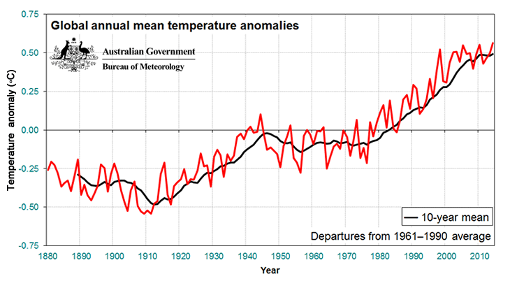
In this case the annual variations are more suppressed (averaging over a larger area, and including buffered oceans), but again the trend upwards is clear. Broad multi-decadal patterns are clear, and there has been some slowing of the rate of increase over the past decade.
But that is different from a decrease, with temperatures still incrementally getting hotter, as the trendline illustrates. The year 2014 is expected to be the hottest on record, or close to it.
Much of the additional energy being trapped at the Earth’s surface by increased greenhouse gases is being absorbed by the oceans, sometimes referred to as the ‘flywheel’ of the climate system due to the capacity of large bodies of water to store (and then gradually release) heat. Here is the plot of the trend in sea-surface temperatures off the coast of Australia:

This heating of the oceans, along with land-based ice melt, is contributing to an ongoing trend in rising sea levels; perhaps the ‘best’ (i.e., most integrated and smoothed) metric of the Earth’s planetary energy imbalance:

And here is a ‘zoom in’ on the most recent decades of satellite monitoring data of sea level:

Here are some key summary points of climate records for Australia in 2014:

The message is clear. We need to act now to mitigate and eventually reverse these upwards trends. The key target involves around finding effective ways to replace fossil fuels with zero-carbon alternatives. That’s the focus of this blog… but it’s worth occasionally reminding ourselves of the extent of the problem we face.

18 replies on “Climate heating for 2014 in Australia”
Indeed, Barry, a reminder of the problem is timely but an accompanying assessment of how serious it is would be useful too.
At face value, the above BoM record for the last 50 or so years of temperature anomalies for Australia shows a rise of around 0.15 degrees per decade. The global figure (e.g. UAH satellite-based Lower Atmosphere) looks to be a bit less, around 0.1 degrees per decade. The recent global mean sea level, as shown above, has been rising at 32 mm per decade.
Could we live with all or any of those rises? And how much faster will the increases be with the inevitable further rises in atmospheric carbon dioxide? In my view, those are the big questions for climate science and its biological offshoots.
As for mitigation and reversal of these trends, the big issue is, as you say, “finding effective ways to replace fossil fuels with zero-carbon alternatives”. Trouble is, about half of the population of western nations (that’s an educated guess – would be nice to know the real number) thinks those replacements have already been found, in renewables. So the truly fundamental issue is, how do we know when we have found an ‘effective’ substitute for fossil fuels? How do we resolve the continuing argument (“yes they can, no they can’t …..”) whether renewables can effectively replace fossil fuels? I’m not saying I know the answer, but I do know there’s been a lot of very loose thinking on the subject.
To start with, the focus is nearly always on electricity, when this represents less than half of our energy needs at present. ‘Effective’ has to take account of quantity, quality and cost of the alternative energy sources. The pursuit of ineffective alternatives could be risky and expensive, which is why proper assessment of effectiveness is so important.
LikeLike
Such evidence looks very convincing so why is it difficult to get through to the general population?
There are a number of prominent sceptics, particularly those in the media that have large followings among members of the public and while they continue to promote their own beliefs there is always going to be substantial resistance to uncomfortable facts.
It would be worthwhile for someone, or a small group with sufficient experience (expertise and ability to argue convincingly) who could identify and then work on key sceptics. Convincing even one with genuine argument rather than just shouting them down will have a disproportionate effect.
Prominent sceptics should ALWAYS be invited comment on reports like the Annual Climate Statement as even their continued disbelief would be worth reporting and maybe they will eventually see the light and swap sides.
There must be readers of this blog who would be up to such a task.
LikeLike
Half a degree C every 30 years puts it at 2 deg C rise from 1980 in the year 2100.
LikeLike
For completeness, here is the corresponding graph of atmospheric CO2.

What is not clear is that there is a lag between the arrival of CO2 in the greenhouse and the eventual rise in global mean sea level. Somewhere I have read that the lag is “about thirty years”, but I suspect this measurement was based on the perception of elbows in the CO2 and temperature graphs. However the updated graphs above do not show any such features to match.
It would be incorrect to conclude that if the CO2 level was to stop rising, the sea surface and air temperatures would also stop rising immediately. We need to know what that time lag is.
Of course, some heat contributions will be immediate, while others take tens of thousands of years, but the bulk of any change will be delivered in a few decades. We need to know just how many decades of climate worsening lies ahead of any (hypothetical) elimination of emissions.
LikeLike
The time lag is because oceans have very big heat capacity and because it takes time for heat to penetrate into deeper layers. ARGO floats have measured an imbalance of about 0.6W/m^2, which means there’s this much warming in the pipeline and some more because of feedback systems.
How much more? That’s a million dollar question. It can be estimated from paleoclimate data. Best guess is about 3°C for 560ppm CO2, and if we stop at 400ppm that will probably be somewhere in the range of 1.5-2°C. IPCC report contains some probability distributions about this issue.
LikeLike
Both the Greenland and West Antarctic ice sheets are grounded below sea level. Once the water is warm enough the grounding line of the ice retreats. That is happening now.
Further inland than the current grounding lines the ground slopes going inland. So even more of the ice will be exposed to melting conditions. The effect will be ever increasing sea levels for a long time to come. Centuries, I opine.
To avoid this requires more than the end of emissions. It requires active removal of CO2.
LikeLike
Gene says, “Half a degree C every 30 years puts it at 2 deg C rise from 1980 in the year 2100.”
That would be true if the rise in temperature will remain linear. However, the forcing function driving it, the rise in CO2 is exponential. That is, it’s accelerating. Check out the curvature of the CO2 graph above. The climate is going to hit a wall if that goes on, so something is going to break. We will hit a “tipping point”.
Worldwide, leaders make a lot of talk about “reducing” emissions. Partial reduction could only stop the rise if there were a lower, sustainable rate of CO2 emissions, where some process in the hydrosphere would increase to sequester the extra CO2 as it appeared. If that were true, we would have already seen a temporary flattening of atmospheric CO2 somewhere on that graph.
Do you see any flattening? No. Mere “reduction” is not enough. Hitting a tipping of some sort will wake us up, that we must replace carbon entirely. But what we replace it with must be ready when our leaders are ready to take emergency action.
LikeLike
Roger Clifton, forcing increases logarithmically, so if CO2 is rising exponentially this sums up to linear increase. However, feedbacks can add significantly to that.
LikeLike
LikeLike
PPP, again you have contradicted us without a reference. And again, you’re wrong.
If the heat influx is constant while the exit transparency of the greenhouse is reduced by 4%, the equilibrium temperature inside it increases by 1%. (1% of 300 K would be 3°). That follows Stefan’s Law (where the radiation flux is proportional to the fourth power of the absolute temperature). But that is a power law, not logarithmic.
If the level of the CO2 that is greying out transmission bands in the infrared accelerates, then so does the temperature, as the heat flux banks up to squirt out through the remaining transparency. However muted the temperature rise, it is more exponential than linear.
We can’t extrapolate certainly to future extremes, as feedbacks will kick in. One positive feedback is the greying effect of the increased water vapour content. A negative feedback is the exit radiation (to space) from the water bands in air above areas that were previously dry.
LikeLike
Roger Clifton, Stefan-Boltzmann doesn’t tell you anything about relationship between CO2 concentration and temperature. Logarithmic relationship is derived from equations for radiative transfer. Simplified version for CO2 as reported by IPCC is
dF =5.35*ln(C/C0)
where dF is change in forcing, C is concentration of CO2 and C0 is reference concentration. http://en.wikipedia.org/wiki/Radiative_forcing
For other GHGs formulas are similar and also logarithmic.
LikeLike
PPP, thanks for the reference. Point conceded.
Here is the derivation of the equation, (from the S-B Law!):
Click to access eqn%20derivation.pdf
Amplification of temperature rise by water vapor begs for another equation,
but I couldnt find one, perhaps because of its variation with altitude,
relationship with cloud and convective heat transfers.
LikeLike
@Roger and PPP:
I followed your discussion with interest and appreciate being reminded of one or two basic relationships, but isn’t the really big picture:
a) That the biosphere’s average temperature is rising at a verified rates (air and ocean).
b) That this is due to increasing CO2 and smaller equivalent long-term gases which are forcing temp upwards?
c) That even the existing amount of CO2e in the atmosphere has not completed its task – temperature equilibrium has not been reached.
d) The most important single data point, but perhaps also the most elusive, would be the eventual equilibrium data points for air and sea surface temps AT TODAY’S CO2e levels.
Even less knowable would be the equilibrium sea surface level AT TODAY’S CO2e levels and, perhaps, the year at which these will be reached, assuming even constant atmospheric CO2e concentration.
Where I am heading is that the BOM and others show us the rising limbs of average temperature and sea levels, all of which are bound to continue rising. At some stage, we need to plan a reduction in atmospheric CO2e in order to arrest the rises and to drive downward trends.
Is there a family of plausible scenarios available which tracks future CO2e profiles Vs time? Is it perhaps in the IPCC reports?
LikeLike
@ S.E. Sure, IPCC does project future scenarios, quietly but desperately suggesting urgent action. However the most credible of their trajectories, labelled “business as usual” trends ever upward.
If you can take the past as a prediction of the future, you only have to look at the CO2 graph above. If you want to extrapolate it using its parameters in a Taylor series, you can download the curve’s underlying data from NOAA at http://www.esrl.noaa.gov/gmd/ccgg/trends/#mlo_growth
For its Taylor coefficients I get the derivatives –
A 400 ppm (projected from last month to September 2015)
B +2.1 ppm/a (as of today, endpoint of the trend through the data)
C +0.026 ppm/a/a (gradient of trend from 1959 through to 2014)
A is bad – as we are discovering,
B is the rate it’s getting worse, and
C is the rate of change of the rate of worsening, what I called “accelerating”.
If there is any function underlying this string of numbers, it is that the world’s nations are progressively industrialising using carbon-based fuels. Otherwise each data point is just a summary of the emissions and ocean events up to that point.
Any “plausible scenarios” to reduce A would start by reducing “C”. Reducing “B” would take a revolution in non-carbon energy supply, just what we have been discussing here at BNC. However reducing “A” seems to be beyond our capability.
LikeLike
Suppose that the rest of the world (that is capable of doing so) followed the example of France in the 1980’s, and we stopped trading with anyone building a coal-fired powerplant or coal mine.
France’s electric power went from something like 8% nuclear to 80% nuclear in about 11 years. That reduced the “a” term to a fair degree, forget b and c. That’s hardly sufficient, but it’s an amazingly good start.
What we need is a technology or set of technologies which can displace fossil fuels in niches beyond electric generation: space and water heating, industrial process heat and so forth. I like the idea of meltdown-proof NuScale modules providing distributed generation and district heat to cities. The electricity would supply EVs and electric buses and subways. All of that would be de-carbonized.
The replacement of petroleum fuels and natural gas heat with electric propulsion and either low-pressure steam or heat pumps would leave a few niches. High-temperature heat can be supplied by electricity, albeit at relatively high cost. But even if we had to do something else to get that last 20%, just getting the first 80% would be almost the whole job.
LikeLike
EngineerPoet raises an interesting point. Being localised in towns rather than grid central, SMRs can provide not just distributed generation, but distributed heat as well. I might add that if each of them has desalination alongside, they would be distributing water too. What’s more, it would be hot water, a lot easier to distribute than steam.
As heat pumps come to compete with gas heating, the temperature difference between the reservoir and delivery becomes more important. It takes a lot less power to transfer heat from 40° in the municipal water flowing past to a 40° heat exchanger in the house, than from 10° or so the unmoving subsoil as the heat pump chills it down.
LikeLike
There is (or was) another timelag, due to the cycling of the intermediate waters (the main body of the oceans). Up until now the cycle took several hundred years. However current global warming is already accelerating the cycle.
In the Southern Ocean, the circumpolar belt of winds, the “roaring forties” (and fifties) has been increasing in strength and duration, accelerating the eastbound circumpolar current. Considering that this is a rotation near the bottom of an already rotating sphere, the flowing water is now lifted upward and northward. The effect is strong enough to pull up the entire stack of stratified layers of the deeper ocean and send most of the water north along the surface. (See the recent article in Physics Today )
The upwelling old, cold water is now warmed by the modern atmosphere, delaying the rise in temperature due to the increased CO2, and elsewhere sink, taking heat down with it. The authors imply that this is the cause of the recent slowing of the warming of the atmosphere. With the accelerated pumping, the return of the warmed (and less dense) water to the pump in the Southern Ocean will be lifted with less effort and speed up the cycle more.
LikeLike
[…] 6th January 2015. That was the last time I posted an original contribution to Brave New Climate (BNC) — at least something that wasn’t […]
LikeLike