For context, make sure you read this first: A toy model for forecasting global temperatures – 2011 redux, part 1
Here is a list and brief description of the data sources I will be analysing:
1. Annual global temperature (WTI): This is the ‘dependent variable‘ in the model. The time span is 1979 to 2010. For the first analysis, I will only fit to the period 1970 – 2005, leaving 2006-2010 separate from the analysis for use in out-of-sample validation. The data stream starts in 1979 because this is the year when the satellite data (RSS and UAH) begin. I will use the seasonal average global temperature anomaly (TA) based on the composite measure provided at WoodforTrees. I have done this in order to it side-steps the ‘debate’ over which of the four major temperature measures is ‘best’ – it uses all of them and corrects for different baselines. Seasons are Dec-Jan-Feb, Mar-Apr-May, Jun-Jul-Aug and Sep-Oct-Nov. This gives 108 data points through to end-2005, and 128 through to end-2010.
2. ERSL CO2 from Mauna Loa (CO2): carbon dioxide measurements, in parts per million atmospheric concentration.
3. Total solar irradiance (TSI): PMOD composite values, measuring the intensity of incoming solar energy, in W/m2.
4. ERSL multivariate ENSO index (MEI): based on a sea-level pressure, zonal and meridional components of the surface wind, sea surface temperature, surface air temperature, and total cloudiness fraction of the sky. Details here.

5. JISAO PDO index (PDO): The “Pacific Decadal Oscillation” is a long-lived El Niño-like pattern of Pacific climate variability. Details here.
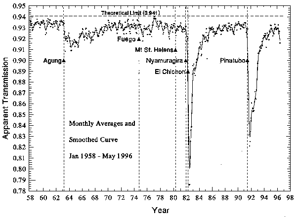
6. Volcano: a binary categorical variable (1/0), based on MLO apparent transmission data. This flags the El Chichón (1982) and Pinatubo (1991) large equatorial eruptions.
Here is a useful list of other potentially relevant climate data sources.
All of my analyses will be done in Program R. Some of the continuous independent data vectors (CO2 and TSI) were centered by subtracting their respective means; this is because they include large constants that are irrelevant to this exercise.
Here is what the structure of the data frame looks like:
'data.frame':   108 obs. of  7 variables:

$ DATE: num  1979 1979.25 1979.5 1979.75 1980 ...

$ WTI : num  -0.1881 -0.1939 -0.098 0.0488 0.0022 ...

$ CO2 : num  -24.4 -22.4 -25.7 -26 -22.7 ...

$ TSI : num  0.53 0.6 0.33 0.58 0.62 0.51 0.69 0.54 0.78 0.72 ...

$ MEI : num  0.327 0.357 0.587 0.794 0.646 0.887 0.471 0.185 0.01 0.248 ...

$ PDO : num  -0.54 0.72 0.79 0.37 0.77 0.82 0.28 0.54 1.01 1.63 ...

$ VOL : int  0 0 0 0 0 0 0 0 0 0 ...
First up, let’s look at a cross-correlation table:
Read this by looking at a row, then reading across to the column. A value of 0 would indicate no relationship whereas a value of 1 would mean perfect (100%) correlation. So, the correlation between WTI (temperatures) and MEI (the ENSO measure) is 0.121, or 12.1%. Okay?
The values in bright red (and slightly larger font) are correlations >50%; the dark red are some other potentially interesting values. As you can see, there is a very strong relationship between DATE and CO2, which is not surprising as it has been rising steadily, year after year. Interestingly, the correlation between WTI and CO2 is slightly higher than that between WTI and DATE — so although WTI are rising over time, and so is CO2, the CO2 predictor is slightly better than DATE. For the later regression models (in the next post), we’ll leave out DATE, since it’s so highly correlated with CO2 anyway (and is not a forcing). But in this post, I’ll use it to look at the overall trend in the data.
Other things to note are that TSI has a slightly negative correlation with DATE over this period, i.e., solar irradiance has declined slightly over this period (1979-2005). The PDO has also weakened a little over the past three decades. Finally, there is a strong relationship between PDO and MEI, as you might expect, since they both measure oceanic conditions. On this basis there are grounds to leave one of them out of the analysis, but for the sake of completeness I’ll leave them both in and let a model-selection statistic tell us whether it is worthwhile including both indices.
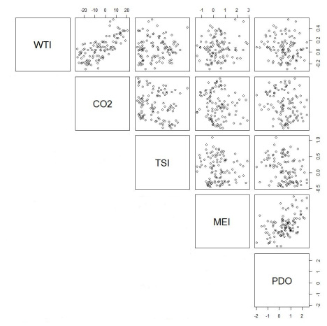
We can also look at this as a series of scatterplots:

You can see the WTI vs CO2 plot is quite bunched together along a ~45 degree line, whereas the WTI vs PDO, or CO2 vs MEI (for instance) are little more than a random sea of points.
The final thing to note from this most simple of analyses is that the correlation between WTI and TSI is extremely small, i.e., in isolation terms (as a direct effect on the WTI trend), solar forcing is irrelevant over this period of time. BUT, when incorporated into a model that also includes other variables (to capture trend etc.), it may yet prove useful in explaining some additional variation in the data.
Now let’s look at the relationship between WTI and DATE, to get a better feel for the trend. Here is the results of a simple ‘gaussian’ fit, with DATE adjusted to remove the constant (1979 subtracted to start the regression at x=0):
Call:

glm(formula = WTI ~ YEAR, family = gaussian)
Deviance Residuals:

Min          1Q      Median          3Q         Max

-0.3444864  -0.1064622   0.0003404   0.0884084   0.3903914
Coefficients:

Estimate Std. Error t value Pr(>|t|)

(Intercept) -0.163348   0.025262  -6.466 3.16e-09 ***

YEAR         0.016595   0.001632  10.169  < 2e-16 ***

---

Signif. codes:  0 ‘***’ 0.001 ‘**’ 0.01 ‘*’ 0.05 ‘.’ 0.1 ‘ ’ 1
(Dispersion parameter for gaussian family taken to be 0.01747063)
Null deviance: 3.6586  on 107  degrees of freedom

Residual deviance: 1.8519  on 106  degrees of freedom

AIC: -126.63
Some things to note. The slope coefficient for YEAR is 0.016595, or ~0.17 degrees C per decade (1.7 C per century). Comparing the residual to null deviance, we can work out that the percent of deviance explained by this model is (3.6586-1.8519)/3.6586*100 = 49.4%. So about half of the total variation in the WTI data is explained by the DATE regression line (as compared to simple the average of the WTI data, which, by definition, explains 0%). I will use the “AIC” value in the next post, when I look at other (more complex) models.
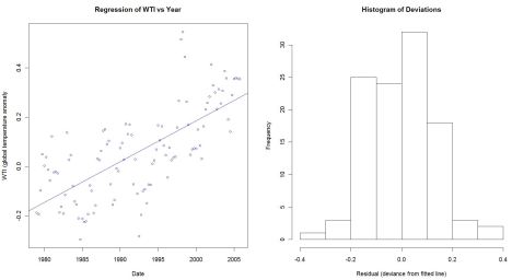
Here is a plot of the fit, and the distribution of the residuals.
You can see that the plot of WTI vs Date follows the data reasonably well, but there are some clear anomalies, e.g. some seasons during 1991, 1998. The histogram of residuals is roughly symmetrically distributed about zero, and follows a normal (gaussian) distribution reasonably well. This tells me that we are meeting the assumptions of this statistical model, and so it will be okay to use a gaussian linear model and an identity link (i.e., no transformation of the dependent data) for the rest of this exercise.
Okay, let’s pause. This is an important topic, and working systematically through this problem is interesting to me. As such, I’d like to make sure that this exercise is broken down into manageable components, to aid in understanding. So, it looks like it will take me more than three posts to get through it all (contrary to what I’d previously anticipated). I guess it will take as many posts as it takes…
Any questions so far? Any other correlates you’d like to argue for inclusion? Any other issues/critiques to raise at this point?
Next post in this series I will fit a range of statistical models (of varying complexity) based on these correlates, do some bootstrap resampling to evaluate robustness of the results to autocorrelation, and make a ‘forecast’ for the 2006-2010 period.
 Featured on EcoPressed
Top 25 Environmentalists Under 25
Filed under: Future


.png)


Clear but why don’t you use lnCO2 rather than the CO2 concentration itself?
If one chooses ones time interval carefully you can show wonderful correlations between all kinds of variables. For the period 1979 to 2005 there is a near perfect correlation between the change in CO2 concentration and the rise in global temperature.
Try the same trick using the time interval 1935 to 1978 and there is an equally impressive anti-correlation. This kind of nonsense is what we expect from Tamino (Grant Foster). I am profoundly disappointed to find Barry Brook stooping to this level.
David B: The relationship is approximately linear over this range of concentrations/time span, as the correlation plot showed – there is little if any hint of curvilinearity that you’d expect if it was logarithmic.
gallopingcamel, as I said in the post, the period 1979- was chosen because this is when the satellite data records started. Would you prefer that I ignore the satellite temperature data? The CO2 data only goes back to 1958, and the PMOD TSI data also only goes back to 1979. So how am I supposed to fit this model back to 1935. And why 1935 – has this got a justification for it, like 1979 does? Why do you think my choice is nonsense? Please justify your rather extravagant adjective.
As I also said, I will fit the model out to 2010 for the purposes of the forward projection. The fit to 1979-2005 is so that I can reserve 5 years for out-of-sample validation.
For the period 1935 (whatever reason this was chosen) and 1978. what do you mean by anti-correlation? A negative correlation coefficient? A zero value? Here is the fit:

Full details here: http://www.climateshifts.org/?p=2275
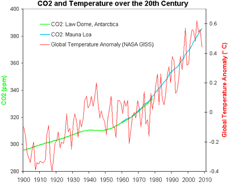
Here is another way to look at it:
Full details here:
http://chartsgraphs.wordpress.com/2009/08/13/excel-chart-misrepresents-co2-temperature-relationship/
There is a clear positive correlation, even over the period you note (which also had clear solar influences, and an strong aerosol cooling effect which was, at the time, almost sufficient to offset warming).
I’m curious though — does your comment indicate that you think the temperature vs CO2 relationship to be random? That is, that the CO2 rise is disconnected from the temperature rise, and they just happen to correlate over this period? If this is the case, one would expect that a model which included CO2 would have little value in predicting the temperature anomalies in the years 2006-2010, correct? (since you seem to be arguing that correlation does not, in this case, equal causation).
Barry,
But since the 1998 temperature peak when ACO2 has been at its highest, the correlation has not been good at all. That 12+ year period is getting on for a goodly term of nothing-much-to-see-here:
http://www.woodfortrees.org/plot/hadcrut3vgl/from:1998/to:2011/normalise:
SD – Why choose 1998? (Why reduce the time period further than is necessary?). Why choose just HadCRUT? I don’t understand what you are trying to argue, unless it is to point out the banal fact that noise is more difficult to distinguish from signal as fewer and fewer data points are available.
The cross-correlation table/charts are interesting. Something I hadn’t seen before.
What happened to inverted SOI? You used it in your previous model.
MEI provides essentially the same measure as SOI, but includes other ENSO-related phenomena beyond just pressure differentials.
Barry,
At the very least you are guilty of “cherry picking”. Just by broadening the time frame by 25 years (1958 to 2010) quite a different picture emerges. See:
http://www.climate4you.com/images/NCDC%20GlobalMonthlyTempSince1958%20AndCO2.gif
Clearly we are not going to persuade each other on this issue so I will not comment further. In future I will confine my comments to our many areas of agreement.
Ah, the wonders of R … possibly the Nth wonder of the world (TeX being the N-1th)
But WTI/CO2 correlation is 0.719 < 0.986 Date/Co2 correlation, not greater than as in the text.
“SD – Why choose 1998? (Why reduce the time period further than is necessary?). Why choose just HadCRUT?”
Barry, I’m just trying to use the most contrarian data to your point.
But the WFTI data is a similar argument.
A quick heads up. Al Gore’s film “An Inconvenient Truth” is showing on Australian free to air TV on March 12th on Nine Network GEM at 6:30 PM.
Geoff, you missed my point. I said CO2 is a better predictor of WTI than DATE is. I was not interested in the CO2 vs DATE correlation.
I guess Barry is confirming the world temperature is increasing. But what happens to ice melting and ocean rises as a function of that temperature rise?
“I guess Barry is confirming the world temperature is increasing.”
Well, it was but just not for the last 12 years and that’s a pretty significant period considering the huge increase in ACO2e emissions in that period:
http://www.woodfortrees.org/plot/wti/from:1998/to:2011/normalise
“Well, it was but just not for the last 12 years”
spangled drongo, you don’t understand what a trend is?
You really don’t seem to properly understand what climate is. I think this comment from a while back exemplifies your lack of understanding quite well. Try reading a little more on the fundamentals before making silly comments like the one above.
Tom Keen, on 7 March 2011 at 12:55 PM — I fear the situation is without hope.
Tom, old chap,
You want trend, this is trend:
http://jonova.s3.amazonaws.com/graphs/lappi/gisp-last-10000-new.png
You do however seem interested in statistics that make a story out of nothing.
Personally, as per the above graph, I prefer these stats that make nothing out of a story.
But Barry is talking 1979 to 2010 and the last 12 years is 38% of that period in which nothing has happened in spite of huge increases in ACO2e.
Would you or even David B B care to address that point?
At first glance, a linear relationship between atmospheric CO2 and temperature should show up as a straight line correlation, even though the emissions are accelerating. The slope of the graph would then allow us to predict the effect from the cause, deeper into a future, when (one hopes) homo carbonis vanishes and atmospheric CO2 levels out.
However, there is a lag time, during which the still-cool mixing layer of the oceans absorbs the extra heat influx. (What is the half-rise time? Ten years?) Consequently the correlations above are between today’s accumulated emissions and the consequence of yesterday’s accumulated emissions.
If both CO2 level and temperature are modelled with simple exponentials, accounting for the delay between cause and effect steepens the graph by a constant factor. So the slope of a simple correlation is too low by a predictable value. Perhaps we will hear of your other models in the next post.
“However, there is a lag time, during which the still-cool mixing layer of the oceans absorb the extra heat influx”
Funny you should mention that, Rog.
http://wattsupwiththat.com/2011/01/06/new-paper-on-argo-data-trenberths-ocean-heat-still-missing/
Yes, of course.
“You really don’t seem to properly understand what climate is.”
Tom Keen,
You made this comment about me in relation to AGW affecting wildlife.
Well, I daily log wildlife populations.
Do you?
And while I see a multitude of problems associated with development growth and human over population I have never come across wildlife that is being stressed by AGW.
Have you?
Your concern with seed dispersal and pollination would apply much more in an ice age than a warm period.
Native flora in the present environment [CO2 and temperature wise] has never had it so good.
If you wish to pursue scientific storytelling here’s a few pointers:
http://www.capitalismv3.com/
But the competition is always out there:
http://www.creditwritedowns.com/2011/03/3000-billion-tons-of-coal-off-norways-coast.html#ixzz1FuU2hJq1
And facts always bear repeating:
http://www.quadrant.org.au/magazine/issue/2011/3/the-intelligent-voter-s-guide-to-global-warming
Roger you mentioned a linear relationship between CO2 and temperature but that the CO2 is actually accelerating and someone else mentioned a lag time on the temperature, all true. But the CO2 level is the integral of the CO2 emissions, which we agree are accelerating also. If the temperature is linear with the total amount of CO2 which is the integral of an acceletasting CO2 and there is a lag time on the temperature rise, then in a few years we should see more rapid increases in the average world temperature. We are already seeing accelerated ice meltings. Maybe the temperature is rising but there is so much noise in the data we cannot see it clearly.
A more accurate model requires two reservoirs [called boxes]. The relaxation time for the first is about 1 year and for the second about 30 years. For more, find ‘two boxs’, ‘volcanic null’ & ‘not computer model’ in
http://www.skepticalscience.com/Open_Mind_Archive_Index.html
I’d just like to address Spangled Drongo’s post at 2:15pm on 7 March. He posts a link to a chart derived from GISP2 data on Jo Nova’s website.
There are several interesting points to note here.
1) GISP2 is a record of climate conditions in the centre of the Greenland Ice Sheet, and is hardly representative of global conditions;
2) There are non-temperature-related factors that affect the oxygen isotope data that the temperatures are derived from, so it’s not even a perfect *local* temperature record (this comment comes from Richard Alley – the source of the data as quoted on the Jo Nova graph);
3) Note that the record stops 95 years “before present”. I understand that the “present” referred to in the data is a carbon-dating reference date of 1950, *not* 2000 as shown on the graph – thus the most recent data shown is actually from 1855;
4) There’s been a *lot* of warming in central Greenland over the past century or so. A bit of googling suggests that the average temperature at the GISP2 site “The Summit” for the past decade is about -28ºC. Note that this is off the top of the graph referenced by SD.
Just thought I’d put that out there.
However, it’s largely irrelevant to the topic at hand, so feel free to delete this post, Barry. 🙂
(Have to admit, I haven’t sat down and carefully followed through your post, so it went over my head a little – must read it a bit more carefully later).
Still struggling to support your claims with published science there, spangled drongo?
“1) GISP2 is a record of climate conditions in the centre of the Greenland Ice Sheet, and is hardly representative of global conditions;”
Bern,
You mean like Mann’s tree ring data?
“Still struggling to support your claims with published science there, spangled drongo?”
Tom,
For a moment there I thought you were going to answer my question about AGW affecting wildlife.
And there’s this trend too, of Phil Jones’ the shows just how “unprecedented” it all is:
http://jonova.s3.amazonaws.com/graphs/hadley/Hadley-global-temps-1850-2010-web.jpg
SD, not sure what you mean by “Mann’s tree ring data”. Would you be referring to Briffa’s tree ring data, perhaps? As discussed here?
http://www.cru.uea.ac.uk/cru/people/briffa/yamal2009/
You know, that’s exactly why, when *real* climate scientists produce temperature reconstructions, they don’t base them on a single proxy from a single location.
Your second link seems to be broken, though – it points to a graph that clearly shows data with an underlying warming trend over the past century and a half, and I’m sure that’s not what you intended… 😉
In view of http://www.colderside.com/, I suggest adding earth albedo or surrogates (snow cover, cloud cover) to your model.
“– it points to a graph that clearly shows data with an underlying warming trend over the past century and a half, and I’m sure that’s not what you intended… ;-”
Bern,
Noone denies there has been warming for the last c1/2but that graph neatly points out how it has been hapening at the same “unprecedented” rate even before ACO2e was a problem.
How much [if any] of it is due to ACO2e is what we need to know.
“SD, not sure what you mean by “Mann’s tree ring data”.”
Bern,
Quite sure you’re not sure?
But anyway IIRC, didn’t he use “One Tree Keith’s” data for splicing on to the 20th c temp records in order to “hide the decline”.
“I’ve just completed Mike’s Nature trick of adding in the real temps to each series for the last 20 years (ie from 1981 onwards) amd from 1961 for Keith’s to hide the decline.”
Phil Jones
Because it denied the MWP, the CAGWers embraced it without any critical validation to the point where it was held up to trhe world as the inconvenient truth.
I think any reasonable person is aware that tree rings are influenced by conditions other than temperatures. Like rainfall, sunlight, cloudiness, pests, fires, soil nutrients etc. so to calibrate temperature from tree rings is near impossible.
Ice cores OTOH, are far more reliable.
“You know, that’s exactly why, when *real* climate scientists produce temperature reconstructions, they don’t base them on a single proxy from a single location.”
Give us a break!
Jim Van Zandt, do you know of a time-series of global albedo that cover this period? I guess it would have to be satellite derived, to account not just for snow/ice changes but also aerosol dimming. I agree that this is a potential ‘biggie’, but the data is hard to get a hold of and may not exist in a form that is useful for this exercise.
Bern,
If you really want to go there [which I’m sure you don’t] there are some interesting developments just emerging:
http://wattsupwiththat.com/2011/03/08/to-serve-mann/#more-35440
Barry,
Here’s something else that may need to be added to the model:
http://www.sciencemag.org/content/early/2011/03/02/science.1200109
SD, do you mean include an index of peak EAIS height above sea level (which seems to be rising, in line with expectations of increased precipitation), or EAIS+WAIS+GIS mass balance (which is clearly declining: http://www.cejournal.net/?p=5066)? Such a measure would be highly correlated with CO2 increase, and so would not add any explanatory power to the statistical model. Indeed, it is more appropriately considered as a dependent variable like WTI, but one with more substantial lags, and probably more akin to a 30-year moving average of WTI.
Similar to Jim van Zandt, I’d like to see a measure of global cloud cover thrown into the analysis, if only because it might serve as a pointer as to whether water vapour is a net positive or negative feedback mechanism. It might also illuminate the bee in Roy Spencer’s bonnet. Not sure about where to get this data; possibly here: http://isccp.giss.nasa.gov/index.html
On global albedo, apparently this is surprisingly difficult to measure. I have heard of schemes to determine it by measuring earthshine intensity, but I don’t know that anything has come of them.
Barry,
Will this help?
http://stevengoddard.wordpress.com/2011/03/08/how-much-has-the-world-cooled-since-1998/
Wow! February 1998 was hotter than February 2011.
Got that book on the fundamentals of climate yet, drongo?
I just put that in to stop you worrying about polar bears and stuff.
>Similar to Jim van Zandt, I’d like to see a measure of global cloud cover thrown into the analysis, if only because it might serve as a pointer as to whether water vapour is a net positive or negative feedback mechanism.
That is a very good question. That charts here show a general decrease in water vapor and atmospheric relative humidity.
http://www.climate4you.com/GreenhouseGasses.htm